The best offense is good defense
Designing an onboarding tool to empower users starting on day 1
Timeline: April - June 2024
Role: Research and UX/UI Design
Problem statement: About 1,000 users join Alma, a mental health platform that supports therapists in private practice, each month. Their onboarding experience exists entirely via email, after which providers are finally given access to the product.
CONTEXT
Users who join Alma are set up to fail.
An onboarding experience predicated entirely on email was causing many issues, most notably:
Users were denied any opportunity to learn how to use the tools and features they were paying for
Any guidance users were given was outside of the product and therefore out of context
What this resulted in was the submission of hundreds of support tickets from users within their first 6 months of membership. The ability of our support team to respond to these requests for help was untenable.
Current experience
Users receive a series of emails during their first few weeks of membership informing them of progress as their account is set up and their credentials are reviewed. The final step is logging in to their user portal for the first time and watch a webinar that contains critical information users need to know to successfully use the product’s tools and services.
PROBLEM DISCOVERY
I started with a review of the existing literature on learnability and adult learning theory to understand the key tenets of an effective learning experience and how that can apply to user onboarding. Applying these theories I identified a critical issue in our onboarding process
Hypothesis
By failing to empower them to confidently navigate the product, we enable a sense of learned helplessness in users.
An onboarding experience that is transparent, contextual, and instructional will effectively teach users how to use our product, ultimately decreasing their reliance on our support team to problem-solve.
How might we empower users to navigate our product with confidence starting from day 1?
GOALS
I was tasked with bringing the onboarding experience into the product by designing a centralized resource that would add structure, visibility, and more dynamic education to the process.

Understand the most common pain points in the existing onboarding journey

Provide users with a centralized resource to guide them through their onboarding experience

Reduce support requests from users who are within their first 60 days of membership
RESEARCH
Surveys
I realized that the terminology each team used to talk about the onboarding process was varied and suspected that this lack of alignment was detracting from the effectiveness of our educational content - if we refer to one process or feature by several different names throughout our support content, confusion would be a very reasonbable outcome. I surveyed +100 users and staff to gain insight into questions like:
When does onboarding begin?
When does onboarding end?
I found significant points of misalignment between teams and users. As a result, I worked with internal stakeholders to outline a plan for updating any educational resources that reflected this misalignment as an additional deliverable for this project.
Comparative analysis
I conducted an in-depth analysis of 10 onboarding experiences. I purposefully looked at products outside of the health and medical industries due to one of the key tenets of a learnable experience - familiarity.
Key insights

Effective onboarding is concise and uncomplicated.
If it’s not crucial for a user to know, it doesn’t belong in onboarding
What are the most common onboarding features?

Onboarding feels disorganized because it is disorganized.
A simplified process will be easier to understand and troubleshoot

We lack data on where we’re losing users during onboarding.
Our onboarding experience should enable this.
IDEATION
Deliverables
Early sketches

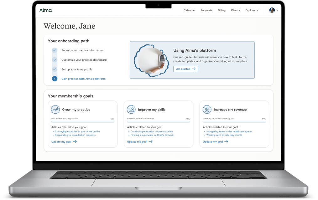
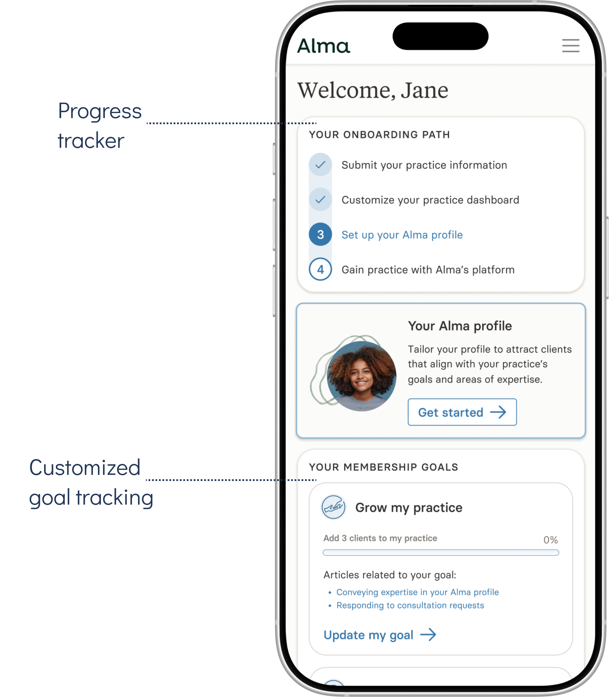
A resource that allows users to track their progress throughout the onboarding journey
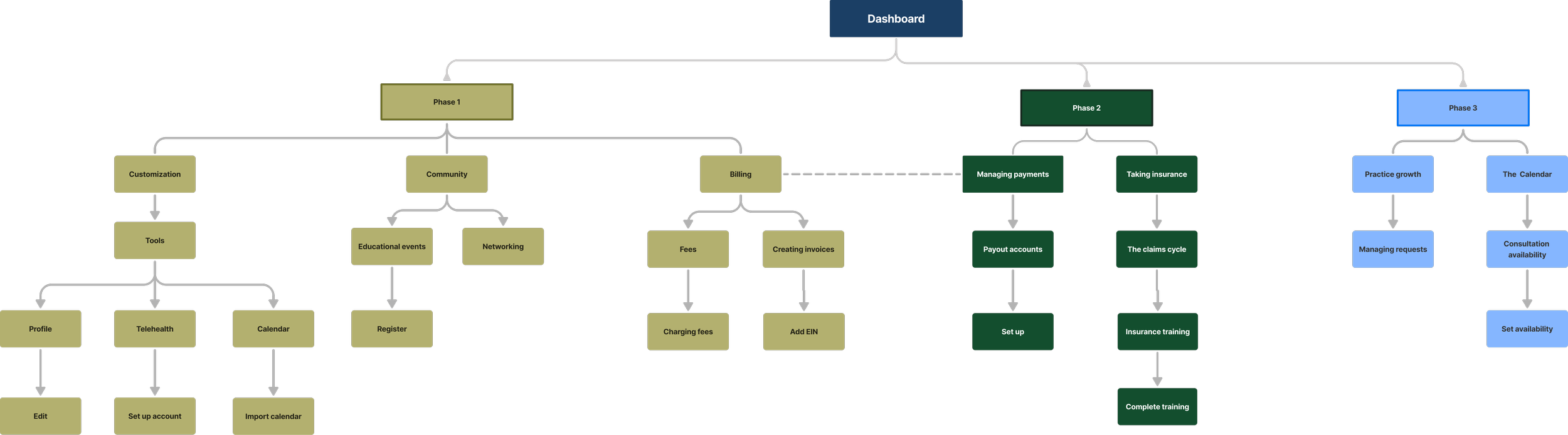
Information architecture

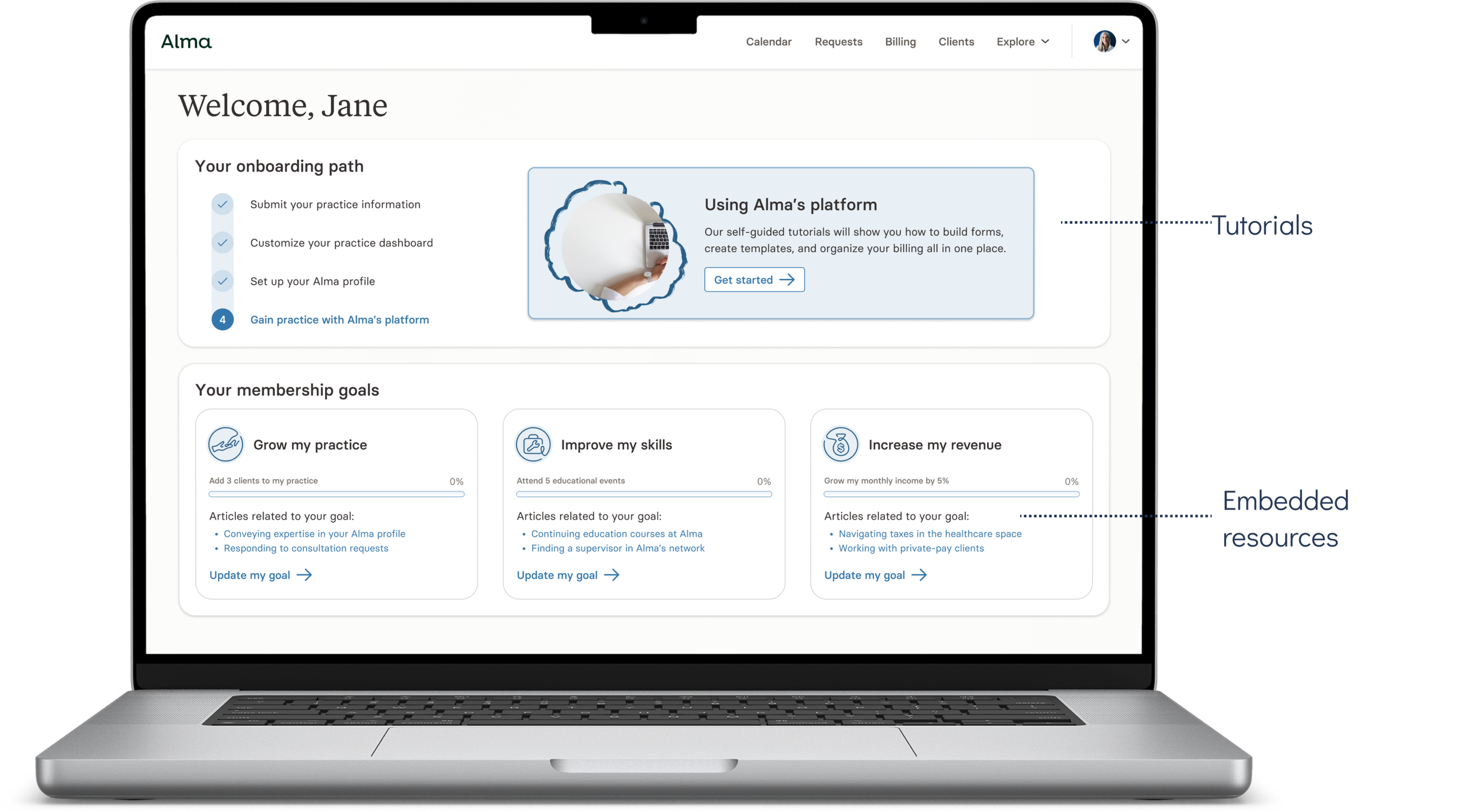
Interactive guides that teach users how to navigate their user portal and perform key tasks

Educational content directly in the product that appears when most relevant to users
ITERATION
Low-fi
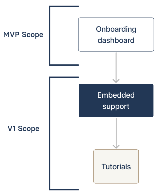
I identified three features that would complement one another to form a comprehensive onboarding tool.
A centralized resource to show the user what should happen, when, and why it’s important.
Embedded support content that would address the resource gap by making content accessible when it’s needed most.
Tutorials that would guide the user step-by-step through completing key tasks that are critical to their ability to use Alma’s tools
ITERATION
High-fi
Personalized onboarding
Members answer a series of questions to curate their onboarding experience around setting goals and customizing their platform in support of reaching them
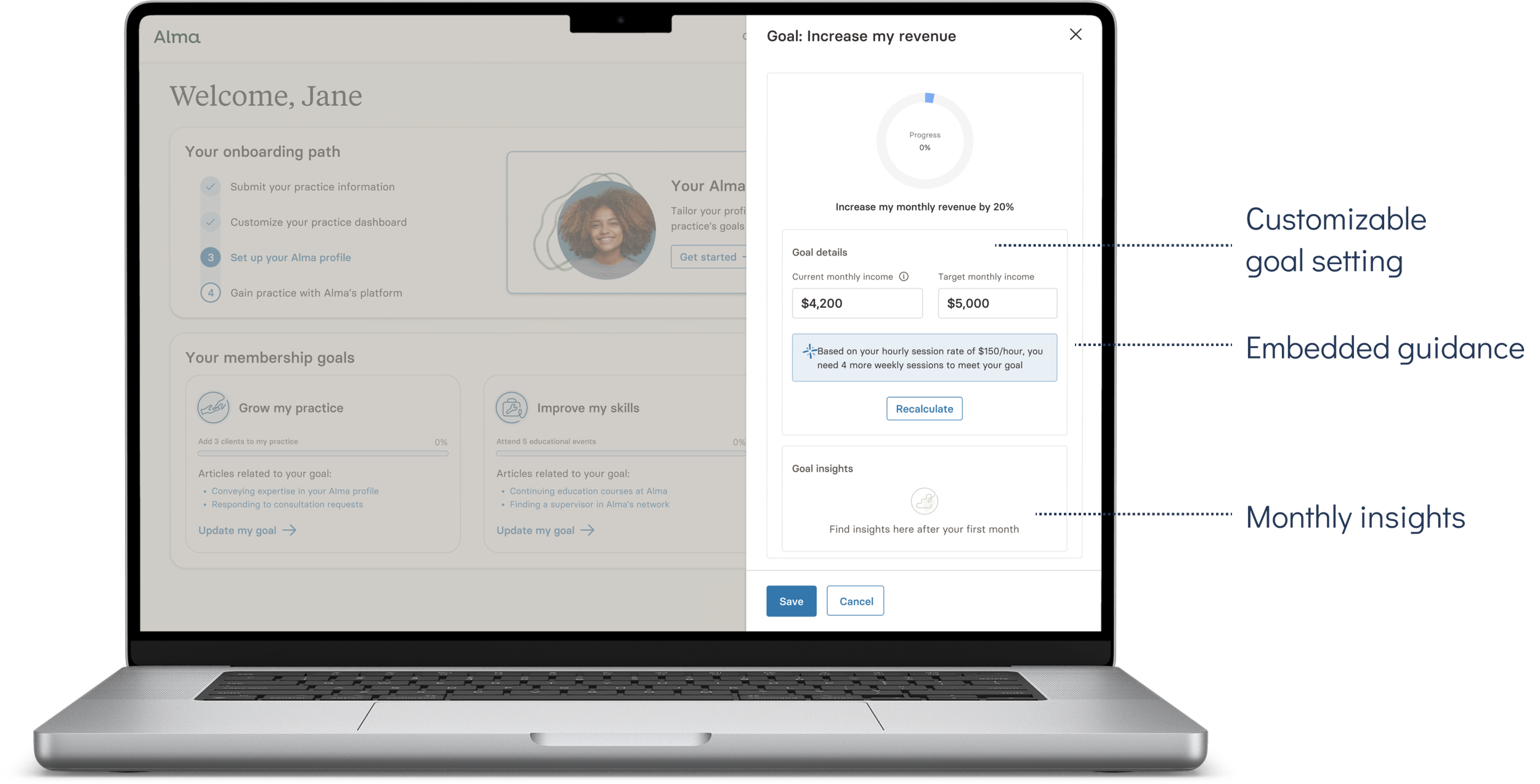
Goal tracking
Members can track, adjust, and gain insight into their goal progress over time directly from their dashboard
Tutorials
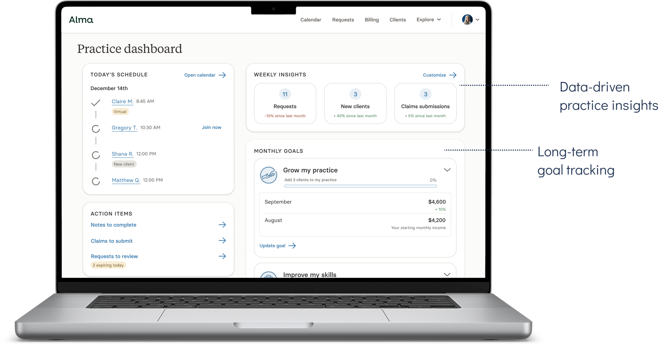
Post-onboarding dashboard
The onboarding dashboard was designed to scale and evolve after onboarding was complete to continue to serve as a centralized resource for providers.
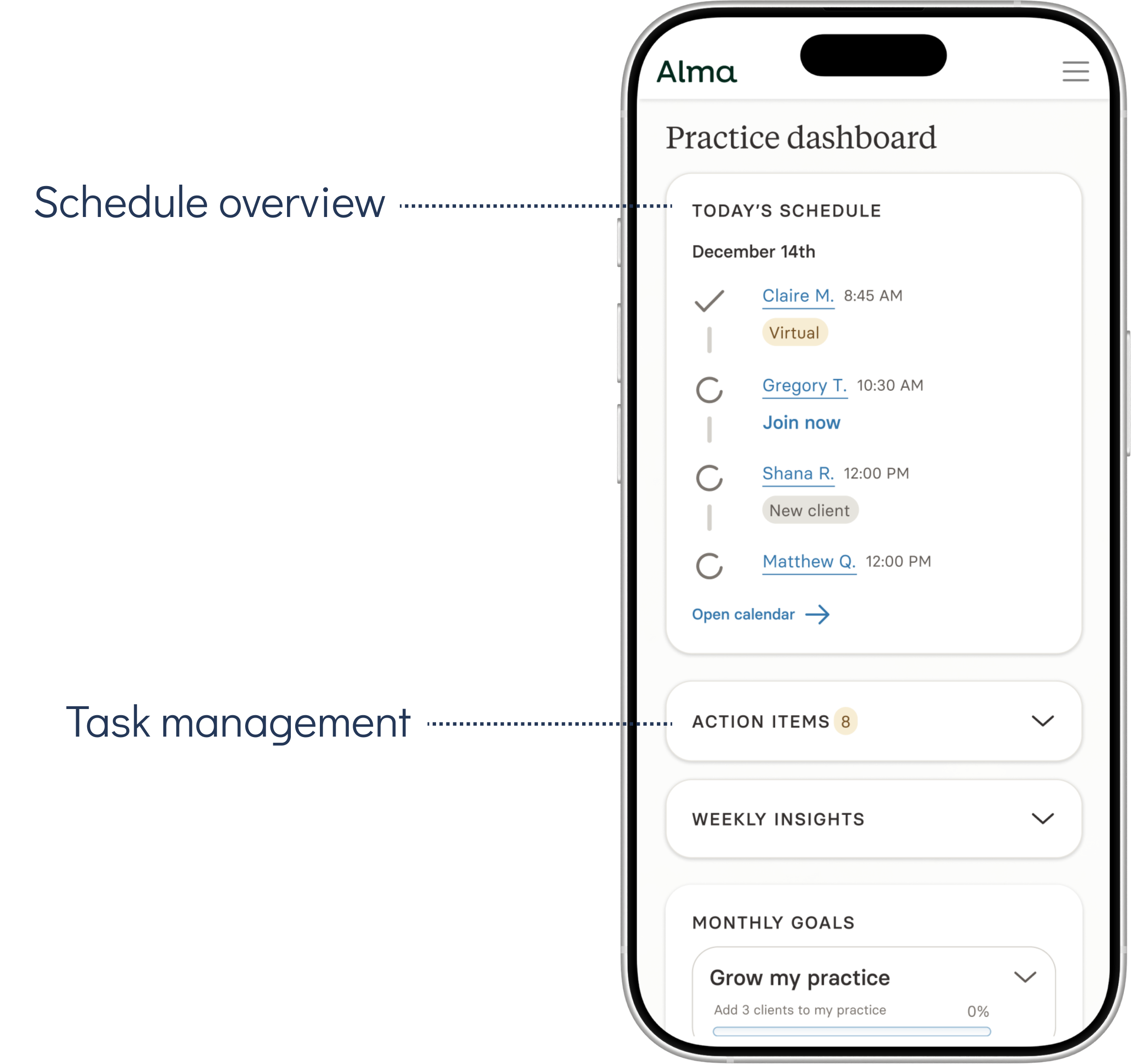
Members have access to brief, targeted tutorials within the portal. Tutorials are categorized based on a member’s set of goals
The pivot
The project scope changed significantly mid-way through the design process due to a few key developments:
Changes to the overall product roadmap that shifted the delivery timeline
Accessibility concerns, adding complexity to the delivery in order to remain WCAG-compliant
Resourcing constraints following an organizational restructuring
The final solution prioritized elements we felt confident would have the greatest impact on two key metrics:
The time it takes for a user to onboard
The number of times they contact Support during onboarding
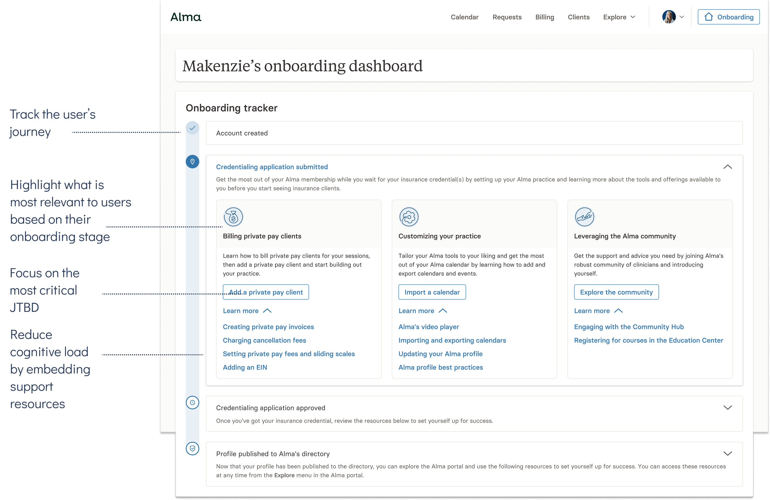
SOLUTION
Alma’s first onboarding dashboard
LOOKING BACK
Impact
The data surrounding this initiative indicating its impact are still pending.
Lessons learned
For such a foundational product experience that sets the tone for a user’s entire lifecycle, establishing confidence that our solution was aligned with user needs should have been non-negotiable. Unfortunately we were restrained by both delivery timelines and engineering bandwidth which pushed us to ship without testing.
A combination of usability and comprehension testing to ensure the dashboard and its content was effective at educating users about the onboarding process and the key tenets of the product should have been prioritized before shipping the MVP. This would have also given us insight into how users might struggle to leverage the dashboard, which would have prepared us to iterate quickly in V1.